Product:
Role:
Work:
Motion Designer
Product Growth
User Research Testing
Motion Prototyping
Background:
New users who had downloaded the app dropped off at the second screen, phone number verification. There was a 36% drop off; meaning within that group, a new user would download the app but would not even make it to the splash page before quitting and deleting.
Objectives:
-
Reduce drop off to from 36% to about 21% (-15%).
-
Users should get a sense of community inside the application.
-
It is crucial that the application should not feel like a private app, but public and community-focused.

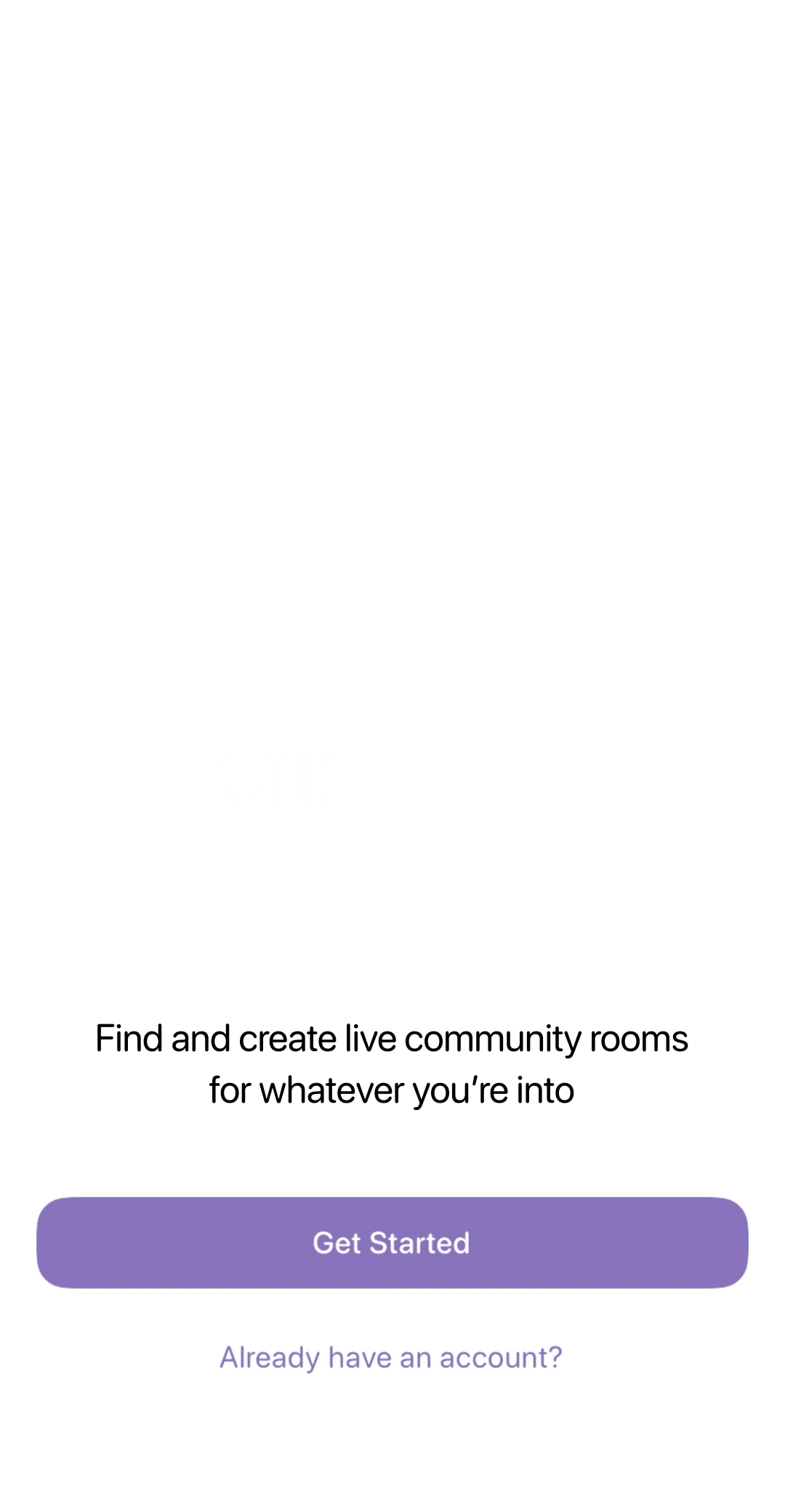
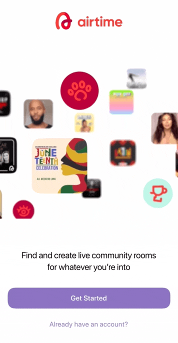
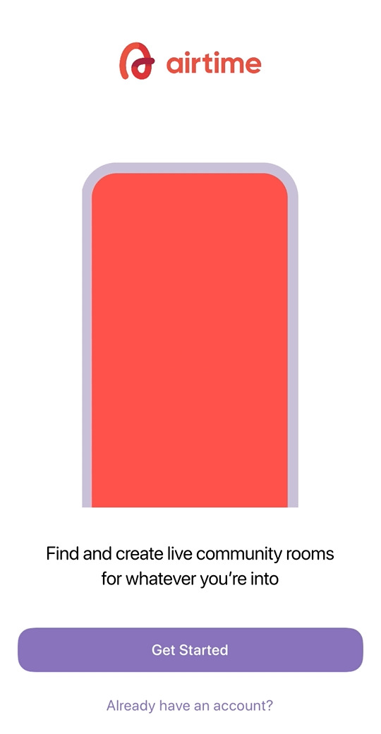
Original Splash Screen
36% Drop off
Branding Style
Step 1: Splash Screen
Step 2: Phone Number Verification
Step 3: Sync Contacts
Hypotheses:
-
Lack of visual similarities between app store listing and splash screen.
-
Less engaging. It does not feel like a "party" that other marketing materials suggest.
-
Calls to action differ between the app store creative and splash screen.
Testing:
-
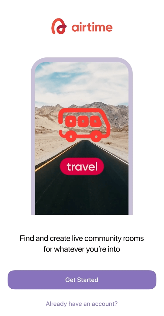
Designed 8 different variations of splash screen that blends community focused product, app functionality, and brand.
-
Worked closely with UX Research to test with focus groups for which screen resonated the most or provoked the most action and response.
Showing live video chatting and in room experience
Icons and ecosystem of active communities
Sizzle reel approach
App Store Video. 2x Speed
Only hip hop community
(top performing) use case
Icon animation of the communities + labeling
Icon animation of the communities only
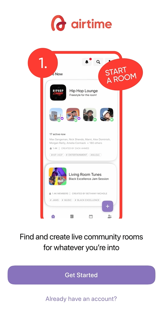
Product Tutorial of starting a room
Findings:
-
Narrowed down to three top performing screens.
-
Responses seemed to focus more around the excitement and context of what is offered in the app.
-
Video Chatting functionality seemed secondary because the context of app store page was understood.

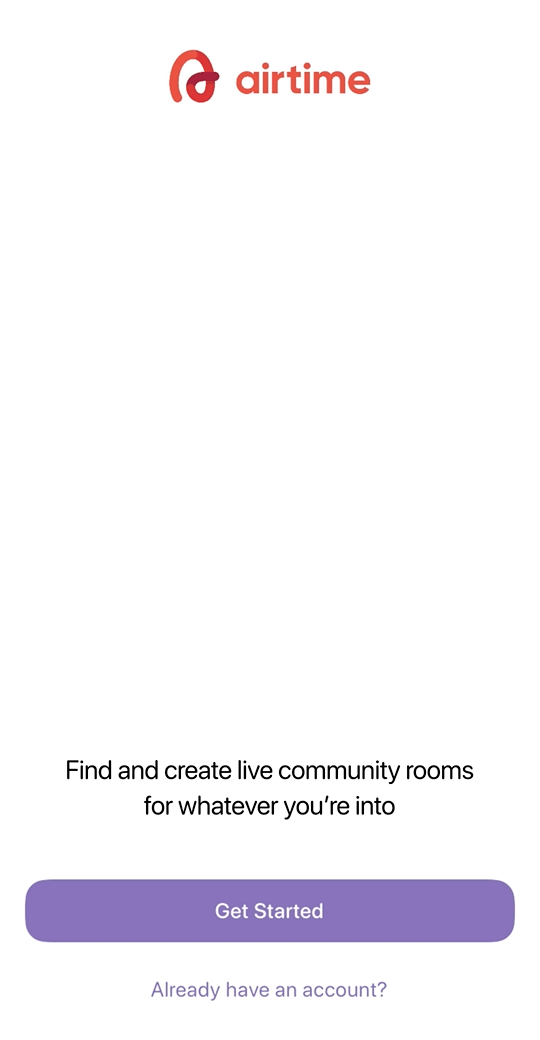
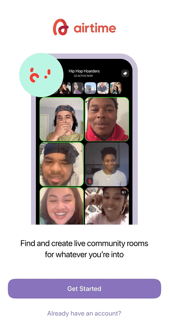
Current Live Asset
36% Drop off
Branding Style
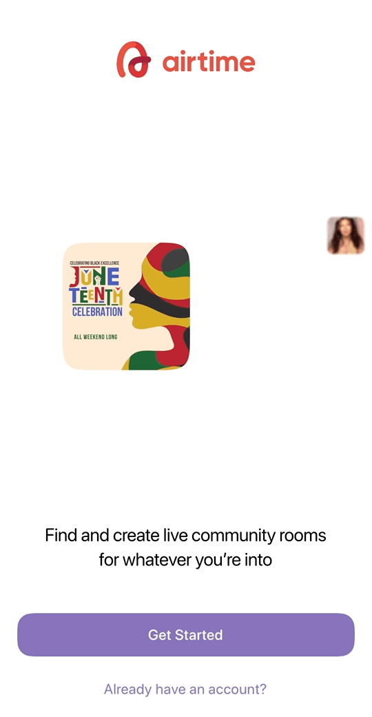
Current Live Splash Screen
17% Drop off
17% Drop off
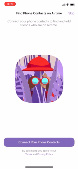
Step 1: Splash Screen
Step 2: Phone Number Verification
Step 3: Sync Contacts
Result:
-
Decreased drop off rate to 19%.
-
Visually represents brand immediately.
-
Gives users a tease of what to expect with the energy of each community.

